Ronpon: A Standout Display Font for Digital Branding
It started with a hero section—just me, Figma, and a client’s new coaching website. The mood board called for “confident but approachable,” “modern but human,” and “memorable without being loud.” I’d already tried three clean sans serifs and two elegant serifs, but none landed quite right. Then I dropped Ronpon into the headline—and suddenly, the whole layout clicked. Not because it was flashy, but because it carried intention: crisp detail, quiet confidence, and just enough personality to feel hand-tuned for digital space.
What Ronpon Brings to the Screen
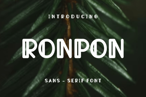
Ronpon is a premium display font built for impact—not decoration. Its letterforms are tightly crafted, with balanced proportions, subtle contrast, and refined terminals that hold up beautifully at scale. It’s not a script or a distressed typeface; it’s a modern display font with editorial polish—think of it as the kind of typeface you’d trust on a boutique brand’s homepage or a product landing page where first impressions matter most. On screen, it reads as both contemporary and grounded—never gimmicky, never generic.
How It Performs in Real Web Layouts
I tested Ronpon across multiple contexts: a sticky navigation bar (too small—pass), a mobile-optimized CTA button (tight spacing required minor tracking tweaks), and most successfully, as the primary headline in a hero section over a soft gradient. At 48px on desktop and 36px on mobile (with responsive sizing), it maintained clarity, weight, and rhythm—even on mid-tier Android devices. The font’s generous x-height and open counters helped significantly with readability on smaller screens, especially when paired with sufficient line height and contrast.
One standout moment? Using Ronpon for a section title inside a course sales page: “Your First Step Starts Here.” With its subtle character alternates enabled, the capital “S” and “H” added visual interest without sacrificing legibility. It gave the page a signature touch—distinctive enough to reinforce brand recall, but professional enough to support conversion goals.
Where Ronpon Shines—and Where to Pause
Ronpon excels in short-form, high-impact roles: hero headlines, section titles, feature cards, logo lockups, and campaign banners. It works beautifully over imagery (thanks to its strong silhouette and consistent stroke weight), and holds up well against both light and dark backgrounds—especially when used with a modest text shadow or background overlay for contrast.
That said, it’s not meant for body copy, form fields, or dense interface elements. I tested it in a blog post excerpt at 18px—it looked lovely, but scanning suffered. Similarly, tiny footer links or mobile menu items lost clarity. As a display font, Ronpon follows best practices: lead with clarity, then layer in character. Use it where attention should gather—not where users need to parse quickly.
Smart Pairing for Balanced Digital Typography
In every project where Ronpon worked well, it was paired intentionally. My go-to combination? Ronpon for headlines + Inter or Manrope for body copy and UI elements. That pairing delivers hierarchy without tension: Ronpon brings voice and distinction; the sans serif grounds the experience in usability and accessibility. For more editorial sites—say, a creative agency portfolio—I’ve layered Ronpon with a warm, low-contrast serif like IBM Plex Serif for subheads, creating rhythm and sophistication without visual overload.
If your project includes multilingual content, double-check Ronpon’s character set. In my testing, it covered Latin-based languages thoroughly—including accented characters and punctuation—but didn’t include extended Cyrillic or Arabic glyphs. Always verify included weights too: the regular and bold styles were present and web-optimized (WOFF2), but no italic or variable axis was available. That’s fine for most branding use—but worth noting if you need typographic flexibility across dynamic layouts.
Practical Tips Before You Implement
Before dropping Ronpon into your next site or client project, here’s what I recommend:
- License check first: Confirm commercial web use is covered—especially if embedding via @font-face or using it in client-facing templates or SaaS dashboards.
- Test loading behavior: Load it asynchronously or with font-display: swap to avoid invisible text during render. Its file size is lean, but performance still matters.
- Respect contrast ratios: Run quick WCAG checks on headline/background combos—Ronpon’s medium weight shines at AA+ on light or dark surfaces, but lighter weights may fall short.
- Use sparingly in SVGs or icon fonts: Its detailed forms translate well to vector, but avoid scaling below 24px in inline SVGs—fine details can blur or disappear on some browsers.
- Preview on real devices: What looks sharp on a Retina Mac might soften on older iOS or Windows tablets. Always validate on at least two physical devices before launch.
Ronpon won’t solve every typography challenge—but when you need a display font that feels intentional, polished, and quietly confident, it’s become my trusted choice for hero moments, brand statements, and any place digital presence begins with a single, well-set word.